multicolored fingerprint

With M&A activity at record levels, marketing thought leadership is abuzz with tips and tricks for maximizing the effectiveness of brand mergers. Such pieces often center on how to align corporate cultures and boost internal engagement. Without a doubt, these are vital issues that demand consideration. But is today’s culture craze sidestepping the more rudimentary, but still important, branding lessons of yesteryear? For example, the power of brand identity design.

In this piece, we highlight three recent logo changes that each, in their own way, send a powerful message about their corresponding company’s internal operations. These examples show how, often, the most successful mergers are those with leaders who embrace true brand transformation rather than amalgamation.

The Unholy Alliance

Chemical giants Dow and DuPont merged in 2017, becoming DowDuPont. Each had an iconic and instantly recognizable identity; replacing them would be a formidable task. So it didn’t. It simply created a cumbersome lockup that placed the existing logos side by side, with a single trademark symbol. This is in marked contrast to other mergers of equals. For instance, ConocoPhillips — a merged company that chose a similar naming strategy — opted for a new, combined logo.

dowdupont logo

Some of this strategy was practical. The entity was always designed to be temporary, and in fact completed its spin offs in June 2019 and has ceased to exist. However, by retaining the two original logos, and keeping them at arm’s length, DowDuPont did not build confidence in its “highly complementary portfolios.” In fact, in the years that lapsed between the merger and the actual spin offs, the company lost more than $40 billion in value, “confounding” its leadership’s expectations of growth. Of course, most of this loss of value can be attributed to business context and operational mis-steps, but the company’s clumsy logo treatment serves as a visual symbol of the company’s failure to live up to its promised synergies.

The Compromise

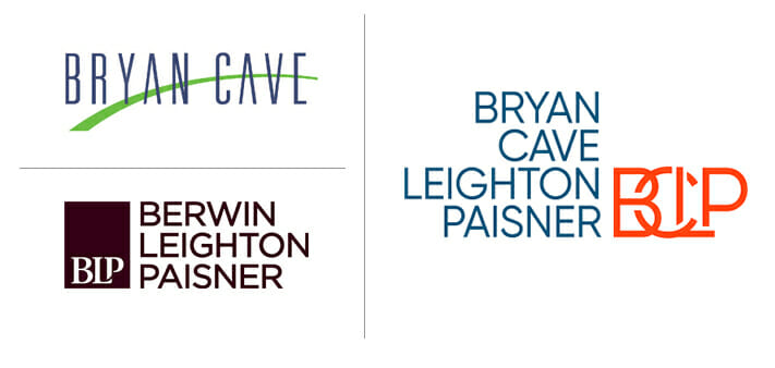
In 2018, American Big Law firm Bryan Cave merged with British-based Berwin Leighton Paisner in order to increase its international reach. Its rename and corresponding logo change largely conformed to legal industry M&A norms; it created a firm whose name was a longer list of surnames: Bryan Cave Leighton Paisner (BCLP). Perhaps as a consolation prize for the loss of “Berwin,” the new logo design echoes that of Berwin Leighton Paisner, consisting of stacked names paired with a monogram of overlapping letters. However, unlike the original Berwin Leighton Paisner, which placed the monogram in a brown bar that spanned and united the list of stacked names, the BCLP monogram is placed in white space, allowing the “Bryan Cave” part of its name to stand alone.

example of logos

All in all, the new logo and name work to suggest that although some conciliatory moves have been made to incorporate the Berwin Leighton Paisner brand and culture, the Bryan Cave brand is the dominant influence. There is nothing inherently wrong with this; it is a reality of many mergers between two companies in which one is significantly larger or more well-known than the other.

However, this strategy is bound to ruffle some feathers. The creation of BCLP has not been without stumbling blocks, as many former Berwin Leighton Paisner partners have left, particularly those in Asia, foiling some of BCLP’s international aspirations. Once again, we see how, to the trained eye, a brand identity can suggest potential consolidation challenges. In this case, the intended dominance of the Bryan Cave brand may have called for greater cultural alignment initiatives among Berwin Leighton Paisner employees.

The Transformation

The 2016 merger of IMS Health and Quintiles created a market-leading provider of both health information technologies and clinical research. To symbolize the company’s category-smashing consolidation, it knew it wanted a brand-new name and logo. However, it was also careful not to rush the change in a way that would upset employees, customers, or stakeholders.

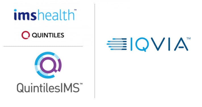
To do so, it embarked on a transitioned transformation. The most well-known version of such a strategy is FedEx and Kinko’s evolution: first into FedEx Kinko’s and then simply into FedEx Office. In this case, Quintiles and IMS Health first rebranded as QuintilesIMS, adopting a temporary merger logo that combined the Quintiles Q with IMS Health’s blue color palette.

A short time later, when internal and external acceptance of the merger was high, the company took on a more radical rebrand. It changed its name to IQVIA, pronounced Eye-Q-via, which contains a nod to the “I” of IMS and the “Q” of Quintiles, but in a completely fresh way. In its logo, it retains the IMS color palette, but by treating IQ and VIA in different shades of blue, the logo emphasizes that the combination offers success “via” a new path. The new typography is light and modern, and the logo’s graphic is reminiscent of both data visualization and forward movement.

logo examples

IQVIA’s careful transformation cost it time and money: it had to introduce not one, but two name and logo changes. But for this company, the more involved strategy ultimately paid off. The company has experienced positive financial performance and reported double-digit growth in real-world business.

Brand Merger Logos: Not Just Skin Deep

Logos are sometimes thought of as the cherry on top of the brand. A nice touch, but far from foundational to a brand’s success. In some ways, especially in B2B businesses, this is true: no amount of investment in marketing and design can equal the value of an engaged workforce who evangelizes the company and its services. However, as the above examples show, brand identity post-merger can often reveal challenges or synergies that impact far more than marketing collateral or building signage. The attention paid to the logo, and which aspects of the legacy brands it retains, can often send a strong message about the integration and priorities of the newly consolidated company following a brand merger.

To learn more about branding after a merger, contact us.

About the author

Dru DeSantis

Dru DeSantis is a cofounder of DeSantis Breindel. She shapes strategic brand identities and powerful brand activations from digital ecosystems to multi-channel campaigns, engaging audiences and achieving critical business objectives.

A Tale of Two Announcements: Communicating Big News at Large Organizations

Two regional banks’ futures are on the line, and all stakeholders await the decisions of the top brass: will a merger-of-equals result in lay-offs? At large firms today, most communication happens through email, and that’s how a lot of news is delivered (hopefully employees never have to learn company news via…

Brand Naming: An Art and a Science

“What’s in a name?” It’s not just William Shakespeare who wants to know. Companies have been pondering this question for years, trying to crack the code for the perfect name to gain recognition — and help their products sell. That’s because a name carries real weight. Brand naming has the power to reinvigorate…

Aligning Brand and Culture: Where Should a Company Begin?

It’s the classic chicken or egg question — which element comes first when aligning brand and culture? Leadership teams often ask us this question during transformation initiatives. While there is no one-size-fits-all answer, there are three critical questions that any leadership team must answer to understand how to begin optimizing the relationship…