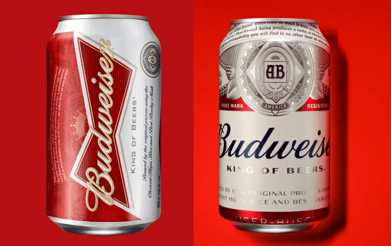
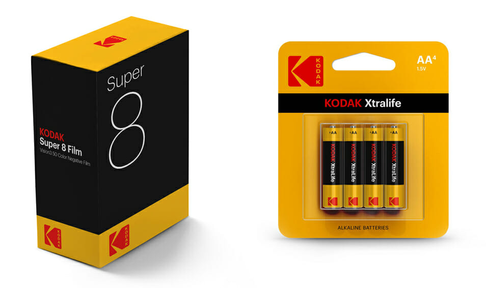
make america great again hat

In the past few years, we’ve seen “authenticity” emerge as a theme in branding and design; this year, it has exponentially increased in importance and value. That’s understandable: in a world where “fake” news can dominate the political conversation and Instagram stars turn out to be imposters, consumers have become increasingly cynical.

A fascinating example of the power of authenticity is the success of the ubiquitous “Make America Great Again” cap in Donald Trump’s presidential campaign.  Despite its clunky typography and simple design, it became a potent symbol and game-changing branding tool. As Fast Company puts it, “The ‘undesigned’ hat represented this everyman sensibility, while Hillary’s high-design branding—which was disciplined, systematic, and well-executed—embodied the establishment narrative that Trump railed against and that Middle America felt had failed them.”

Authenticity in photography

In design, projecting authenticity might include deliberately opting for awkward or unprofessional-looking imagery. Writing for Campaign Live, Pamela Grossman, Getty’s director of visual trends, calls this phenomenon “New Naivety.” As she says, “The slick, obviously-curated aesthetic that early iterations of social media fostered are being rejected, and an unmanicured authenticity is back.”

Graphic authenticity is also expressed with hand-drawn or rough-edged typography.  The artless and even childlike simplicity of this style feels approachable and real, as if it’s not trying too hard to impress us or sell us something. In packaging, it implies that a product is handcrafted or unadulterated. On a book cover, it signals a credible, original voice.

Appealing to nostalgia

Some brands are looking backward to recapture the authenticity of their own historical appeal. In 2011, Anheuser Busch launched a redesign of the Budweiser brand, downplaying the elaborate engraved style that had characterized the brand for decades, and even turning the iconic script logo on its side. Perhaps recognizing that this new look did little to create a compelling brand in the competitive world of microbreweries, AB redesigned the brand again in 2016. The newest redesign restores visual elements from the original brand, even using a new typeface inspired by the signage of the 1860 Budweiser brewery. In 2020, the brand went even further, adopting a tweaked design that adhered even more closely to the can designs of the 1950s—1980s.

Kodak has also mined its archives in an attempt to resurrect its legendary brand. In advance of new product launches that it hopes will reverse the company’s fortunes, Kodak has revived the famous “K” logo, familiar to millions of consumers who bought Kodak products during the decades when it dominated the photography industry. Featuring a red ‘K’ against a yellow background, the logo was designed in 1971 and was in use for 35 years until it was replaced by a red word mark in 2006.

B2B brand typically depend less on packaging to attract customers than their consumer goods counterparts. However, the appeal to design “authenticity” and nostalgia haven’t been overlooked by the category. Many B2B companies, particularly those in the software space, have begun using less-polished photography and bespoke illustration in their design languages. Some have even gone retro; British bank NatWest reverted to a 1968 version of its logo in 2016.

Of course, reviving a struggling business takes more than convincing consumers that your brand is “authentic.” Whether you’re a politician hoping to sway voters or a global company targeting new customers, you ultimately have to do more than signal your authenticity — you have to deliver on that promise. We will see how these “authentic” brand stories play out in the years to come.

About the author

Dru DeSantis

Dru DeSantis is a cofounder of DeSantis Breindel. She shapes strategic brand identities and powerful brand activations from digital ecosystems to multi-channel campaigns, engaging audiences and achieving critical business objectives.

Conducting a Visual Brand Audit

A comprehensive brand audit — an analysis of the current state of a brand and its position in the marketplace — is the foundation of any new brand or rebranding initiative. By determining the strengths and weaknesses of a brand in relation to its market and competitors, the audit helps navigate a clear path to a differentiated…

Technology Brand Colors: Red, Bright and Blue

Technology brands operate in fiercely competitive markets where it’s essential to find ways to stand out and communicate unique value. That means a tech company’s logo and greater visual identity need to launch their brand storytelling on sight—signaling who they are, what makes them different, what kinds of promises they make and…