graphic of eye and brain

Humans have always responded viscerally to visual communication, from the earliest cave paintings to Instagram. But there’s evidence that visual learning is actually more effective than written language, especially in how it’s retained.

Recent research at MIT has revealed a much greater ability for visual recall than previously thought. Which isn’t surprising when you consider that our brain is mainly an image processor, not a word processor — most of our sensory cortex is devoted to vision.

Visual learning has the benefit of being global: we all recognize a tree or a shoe or a cup. And learning to cut up a pineapple by watching a video doesn’t require words. Google even tracks stats for how-to video searches as a separate category in its annual roundup of trending terms.

Words and Images Together

But if you really want your audience to remember what you tell them, show them images and provide verbal support. In “Visual Impact, Visual Teaching,” Timothy Gangwer notes that visual aids in a classroom have been found to improve learning by up to 400 percent. The “dual-coding” theory of cognition postulates that visual and verbal information are processed differently and along distinct channels in the human mind and that are both used when recalling information. Triggering both pathways in an audience increases the chances your content will be memorable.

Putting Visual Learning Into Practice

Many of us already have experience with the power of visual learning: the proliferation of infographics. There’s nothing like a bar graph or pie chart to bring dry statistics to life. But the stickiness of information is strongest when the visuals are simple and straightforward. Here are five ways to improve impact of your brand’s visual identity.

1. One image, one message.

Don’t try to shoehorn multiple levels of meaning into a single graphic. Break the content down and cover one aspect at a time. For example, in an infographic touting a product’s bottom-line value, each chart or graph should have one main takeaway: ROI goes up, response time improves, TCO goes down.

2. Make sure the visual and the intent are in sync.

Do you remember the “invisible gorilla” experiment? Test subjects were shown a video and asked to count how many times a basketball was thrown. In the middle of the video, a person in a gorilla suit strolled through the frame. Half the viewers didn’t see the gorilla. This “inattentional blindness” can prevent a marketing message from getting through — if the visual doesn’t match what the audience is hearing or expecting, they may be blind to its impact.

3. Simple is better.

We are bombarded with images each day, so a message may have only seconds to make an impact. Don’t make the audience search for the meaning of a visual. If you’re showing your product in use, zero in on it quickly so it can be processed before attention wanders.

4. Repetition = recall.

There’s a reason why simple, easily identifiable logos have become the gold standard in branding and visual identity. They can be deployed in multiple media and touchpoints, and every repetition reinforces the audience’s brand recall. Sticking to a limited palette of brand colors and reusing proprietary brand photography does the same job: connecting visual triggers to brand messaging.

5. Don’t be afraid to be memorable.

In one intriguing study, the vividness of a visual mental image was directly related to the ability to recall it. You can build on this natural tendency by using imagery that’s bold and unexpected. Unusual camera angles, strong geometric shapes, and dramatic facial expressions can boost the impact of your brand’s visual identity.

So it does seem that “a picture is worth a thousand words.” Your audience will retain information better if you align your words with great visuals, making your message more memorable and effective.

About the author

Dru DeSantis

Dru DeSantis is a cofounder of DeSantis Breindel. She shapes strategic brand identities and powerful brand activations from digital ecosystems to multi-channel campaigns, engaging audiences and achieving critical business objectives.

Color For Your Business: 3 Ways to Use Corporate Color More Effectively

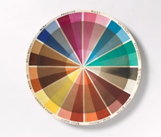
In 2018 we visited the Cooper Hewitt, Smithsonian Design Museum’s exhibition, “Saturated: The Allure and Science of Color.” The exhibition covers the development of color theory, and traces its application from antiquity to modern times through more than 190 objects. The director of the museum, Caroline Baumann, emphasizes that the exhibit “advances our understanding…

Breaking Through with Brand Purpose

Mission, vision, values: if you’re of a certain age, when you hear these terms you might feel transported back to the 80s or 90s, to the height of the “planning school” and corporate jargon. In 1984, one influential business writer proclaimed, “everyone agrees they are necessary” — and the stats back this up. In 1991…

Envisioning Your Brand Image: Unlocking the Power of Visual Cues

The ironic thing about your brand’s image is that you can’t actually see it. Image as it relates to your brand is a metaphor, an idea meant to conjure up the assured sense of truth that comes with witnessing something concrete (and hopefully positive) with your own eyes. Your customers can’t see loyalty, trust, or any other quality, but an effective brand strategy can help them make the connection. First though, you’ll need to learn to see these qualities yourself.