Subscribe to Our Newsletter
Technology brands operate in fiercely competitive markets where it’s essential to find ways to stand out and communicate unique value. That means a tech company’s logo and greater visual identity need to launch their brand storytelling on sight—signaling who they are, what makes them different, what kinds of promises they make and what breed of experience they’ll deliver.
Leading a tech company’s visual brand story will be their primary brand color.
As brand strategists and designers, we help our tech clients weigh their options by sharing insights from color psychology: the study of how colors affect people’s emotions, thoughts, beliefs and actions. Colors drive certain perceptions on an instinctual level, and over time, they’ve also become associated with different industries and points of business value. So it’s important to understand the implications of choosing one color over another when rebranding or building a new tech brand.
Do your customers look to you for constant innovation, helping them disrupt their own markets? Are your investors heavily motivated by promises of eco-friendliness? Do your B2B clients demand reassurances that your platforms are rock-solid reliable, ensuring the stability of their businesses?
The answers to these questions guide brand strategy—including the choice of brand colors. With just one look, tech brands can trigger feelings and associations that will attract the right partners.
Let’s get right to some visual examples. We took a look at the top 100 technology firms, identifying brand color trends and exploring the rationales behind them.
For tech companies, blue is always true
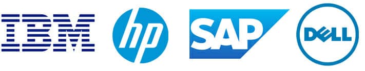
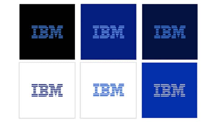
Unsurprisingly, more than 50% of the top 100 tech brands included elements that were medium-to-dark blue or black in their logos. Some of these brands, like IBM and HP, date back to the era when tech companies sought to be viewed as stable corporate partners (rather than game-changing disrupters).
Blue is a perennial choice across corporate branding. Not only is it the color most people cite as their favorite, it’s also associated with stability and success. On an instinctual level, blue is calming. A business that offers serenity must be an extremely competent one.
Both dark blue and black also signal sober authority, something early tech pioneers were anxious to communicate.
As the tech sector matured, blue tones lightened and brightened. We’re not sure when corporate photographers started using blue gels in their shoots, but among stock photo choices, the cyan-toned conference room and cool-blue laboratory remain extremely popular.
Over time, bright blue came to represent cutting-edge technology—a popular choice for tech firms that wanted to stay in the blue family but kick up their liveliness quotients.
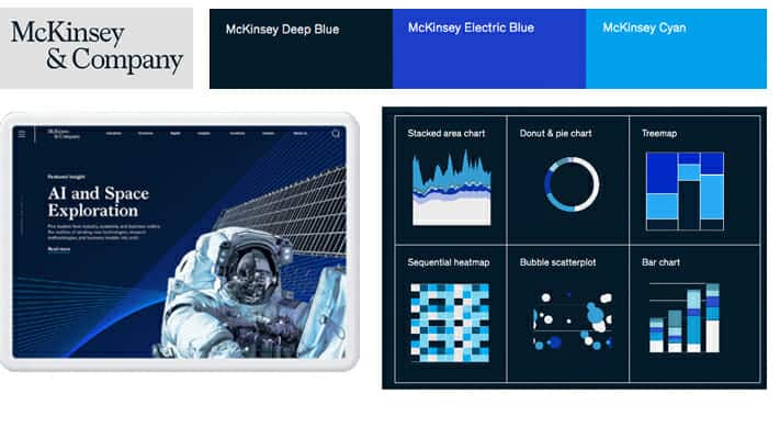
Associations between blue and technology became so strong, even companies that weren’t historically tech brands started using it to signal their entries into more data-focused arenas. McKinsey’s 2019 rebrand, for example, relied on a full range of amped-up blue tones anchored by the brand’s still-sober word mark (in a deeper blue).
Prominent tech brands continue to double down on blue, but now in brighter shades. In particular, electric blue has resurged in popularity because it pops so well in digital applications. See Zillow’s revamped electric blue logo and proprietary icons, now easier to spot on small screens. (Anyone who used a PC in the 1980s and ’90s may feel a sense of deja-vu, as this same blue was ubiquitous across early software programs and websites.)
Even IBM has expanded its blue palette to include a variety of bright blues. The flexibility and visibility of these hues is useful to a large, global tech firm whose products meet multiple needs.
Tech branding makes rainbow connections
If you could time-travel back to the 1980s, you’d find yourself in a sea of black and blue technology branding: IBM, HP, Microsoft, Dell. But you’d also find the iconic rainbow-hued Apple logo, which announced from the beginning that the brand was setting out to “Think Different.”
At the time, Apple’s logo stood out as a startling departure from the norm. But the idea of using rainbow colors to signal enthusiastic newness never died. Exciting red, reassuring blue, optimistic yellow, and green—the color of growth—come together in an eclectic combination that announces a new day.
In 1997, eBay bounded into the online shopping world with a new concept and a bouncy, colorful logo. eBay’s logo letters have since settled into a less playful alignment. But the brand’s enduring, multiple colors still allude to the endless variety of new items to be found on the site.

Google also used multiple primary colors in its logo when the brand launched in 1999, signaling curious, impish energy and hinting at the infinite possibilities in the Google search universe. The logo has since been flattened and streamlined, but it’s still the primary element in a brand that has become a global powerhouse. The Google logo is so recognizable, in fact, that the company regularly alters it for Google Doodles—something most brand managers would forbid (or at least limit).
Even the most business-like tech brands got in on the power of rainbow colors. When Microsoft launched its game-changing Windows operating system, it signaled its newness with a wavy four-color “flag.” Those four squares later evolved to become part of the Microsoft corporate logo.

When tech brands need to feel serious, they start with black and add something zingy
What’s a tech company to do when it wants to look edgy but also instill confidence? Add a pop of bright color to a base of stability-signaling black or gray. We found several tech companies in the top 100 that employed this strategy. And it makes sense: you can inject as little or as much color into your visual brand as the application requires.
A good example is computing innovator Nvidia, which pairs black and bright green in its high-impact, high-visibility brand. Black and charcoal gray lend gravitas to Nvidia’s communications while bright green underscores its future-focused computing expertise.

Consulting giant Accenture also took this approach during a 2017 revamp. The company simplified its black word mark (going with a more straightforward font) but amped up the color and weight of its signature symbol: an arrow pointing forward. As a bigger, bolder graphic, the Accenture arrow was also deployed to represent different business lines, each assigned its own bright color.
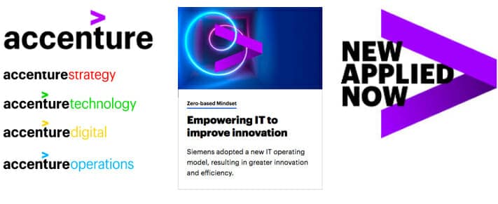
As with electric blue, the use of neon green, scarlet and three-alarm yellow can be very effective (even in small doses) on a small screen. Accenture reserved vivid purple for its overall brand accent color, a bold and dynamic choice. Historically, purple is the color of royalty or luxury, signaling an elevated experience.
Red’s not broken, so many tech brands don’t fix it
Quite a few tech giants launched with excitement-building red as their primary brand color—and stuck with it even after the hue lost some of its tech branding allure. While technology start-ups now signal their edginess with confetti-hued logos or green branding (announcing “We’re sustainable!”), companies like Xerox and Texas Instruments retain their legacy crimson.
For established B2B brands like these, we understand staying loyal to longstanding and well-trusted visual identities. But we also think red is worthy, even underutilized in an industry as vibrant as tech. Bold and in-your-face, red inspires feelings of excitement, raw power and leadership. It doesn’t hurt that it also looks great across digital interfaces.

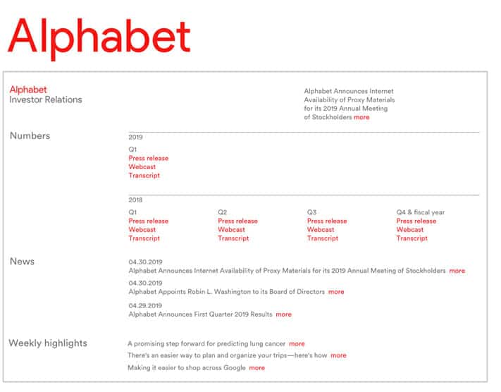
Interestingly, Google chose bright red when it launched investor relations platform Alphabet in 2015. Considering how low-key the spin-off company is, we found it an unusual choice. But the overall Alphabet brand is otherwise blandly generic, and red can be an effective punctuation color for text-only environments. With just this one hue, a simple brand identity came dramatically to life.
Whatever the color, expect it to be bright
As evidenced by many of the examples above, we expect to see increasing brightness across tech brand colors for the foreseeable future. So keep your sunglasses handy!
Companies are tweaking their blue logos to be lighter and brighter, sticking with candy-colored mashups and adding neon (neon!) to their palettes. While these shifts could just be part of a short-term “me too” design trend, we believe they’re also driven by the functional value of brighter colors across digital applications. On small screens, these colors draw our eyes and simply demand our attention.
We’ll continue to track the use of different colors. We’ll also remind our tech clients of the stories they tell and the perceptions they trigger. Tech stakeholders move fast and roam mostly-digital channels. So with every brand color signal, tech brands can invite them to the shared journey they’re looking for.
To learn more about choosing the right colors for your technology brand, contact us.
Originally published May 9, 2022.