Back in 2018, our team visited the Cooper Hewitt, Smithsonian Design Museum’s exhibition, “Saturated: The Allure and Science of Color.” The exhibition covered the development of color theory, tracing its application from antiquity to modern times through more than 190 objects. The director of the museum, Caroline Baumann, emphasized that the exhibit “advances our understanding of what can be achieved when we experiment and innovate with color.”
We know from our branding work that corporate applications of color theory abound. Here are our top three branding takeaways from “Saturated: The Allure and Science of Color” as they apply to the use of color for your business.
Three Ways to Use Corporate Color More Effectively
1. Use trendy colors the right way
Just like topics on then Twitter (now X), brand colors trend in and out of style.
This has produced a demand for “color forecasting,” the art of predicting what colors will be popular in the future. PeclersParis, an agency that specializes in this practice, produces a biannual Colors Trend Brook, which was a featured item at the exhibition.
While PeclersParis’ forecasts are used most often by fashion designers and creators of consumer products, they have value in the B2B space. Trending colors can help to inspire a design team, and they can be applied to future marketing campaigns to leverage established popularity.
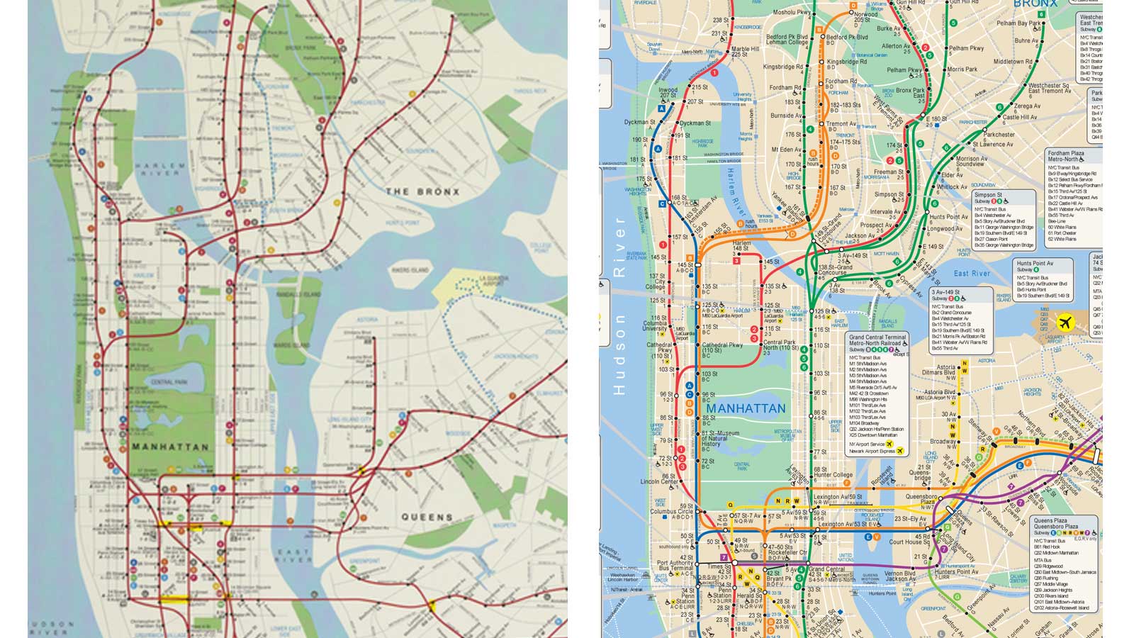
2. Let color clarify
In one feature called “Navigating Color,” the museum showed how color can organize information and clarify intent.
One of our favorite examples was the Prototype for New York City Subway Map by Michael Hertz Associates, designed in 1978. The first design iteration used the same color for all train lines, making it hard to distinguish between them. But in the final design, a distinct color was used for each line, providing optimal visual clarity.
Corporate charts and infographics also benefit from the use of color for definition and emphasis. They have their own need to assist with navigation: helping customers find their way to the product offerings right for them.
Subscribe to Our Newsletter
3. Harness color choice as a differentiator
Color choices can make a brand blend into the pack—or stand out vividly.
One striking example at the exhibition was the Jonathan Ive design for the original iMac. The bright, neon colors Ive chose for the computer’s case differentiated the computer from its beige competitors and signaled the delight customers would find inside. As Steve Jobs said, “for most consumers, color is more important than megahertz, gigabytes, and other gibberish associated with buying a typical PC.”
Choosing a color that is unexpected in your industry is still a valuable way to capture attention in a competitive space. And Jobs’ quote speaks to a key mandate of any business: understand your customer, and anticipate what will attract them to your offering.
Our takeaways are simple: use color wisely to inform and define, and don’t be afraid to let it bring excitement and joy to your brand.
Want to discuss harnessing the power of brand colors to set your brand apart with clarity? Let’s talk.
Originally published December 2, 2018.