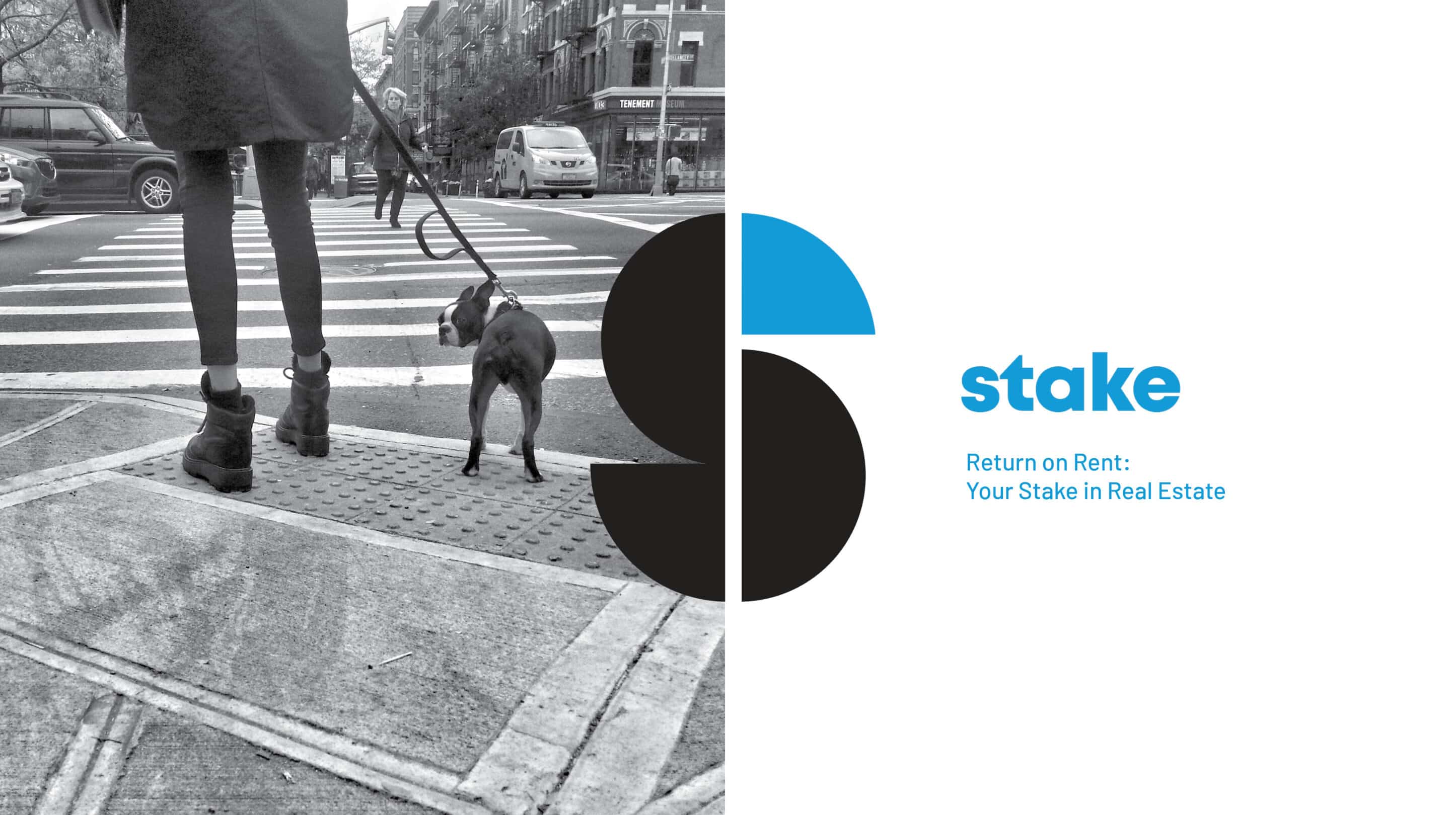
Stake
Defining a space in the industry for a new, radical real estate start up
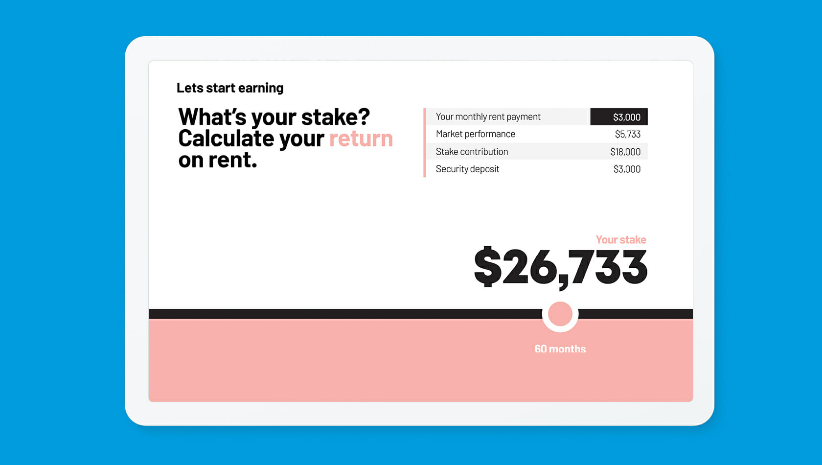
Stake believed that rent was an endless broken cycle—with owners spending billions to acquire renters, and renters leaving quickly because of high costs. But the start-up also had a vision: to create an entirely new system that delivered efficiencies for owners and invested a portion of renters’ monthly payments to help them earn a “return on rent.” With such a radical idea, Stake needed a brand story and identity that would support its offering and generate buy-in among its many audiences.
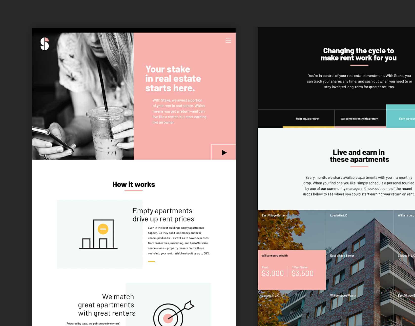
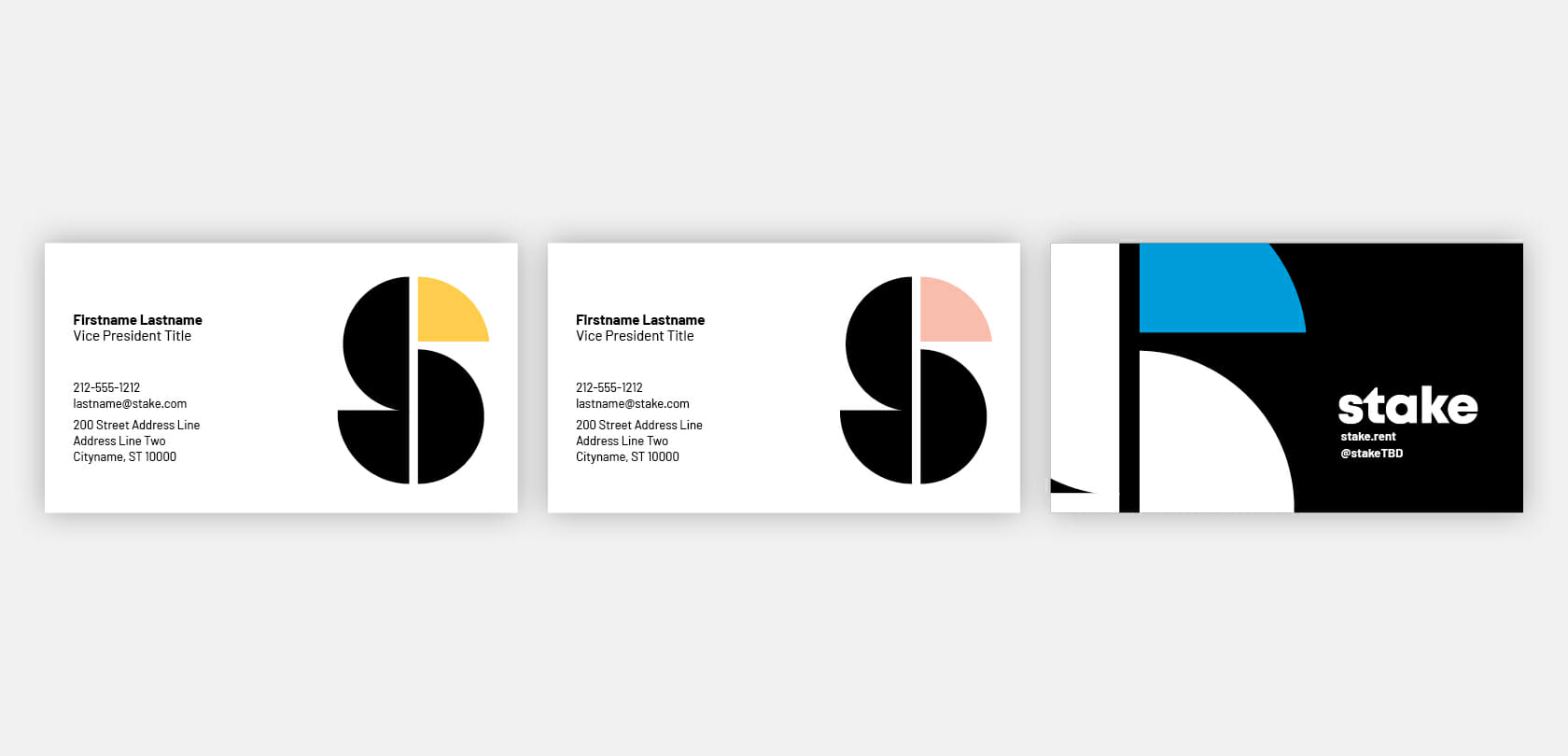
Before Stake could go to market, it needed a story that was both ownable and understandable. We worked with the start-up to determine what angle would resonate best with their audiences—and ultimately positioned Stake as a smarter third option between renting and owning that brings together the best of both worlds. This lens continued to guide us as we developed a striking visual system for Stake—one that felt fresh and friendly for renters, owners, and investors alike.
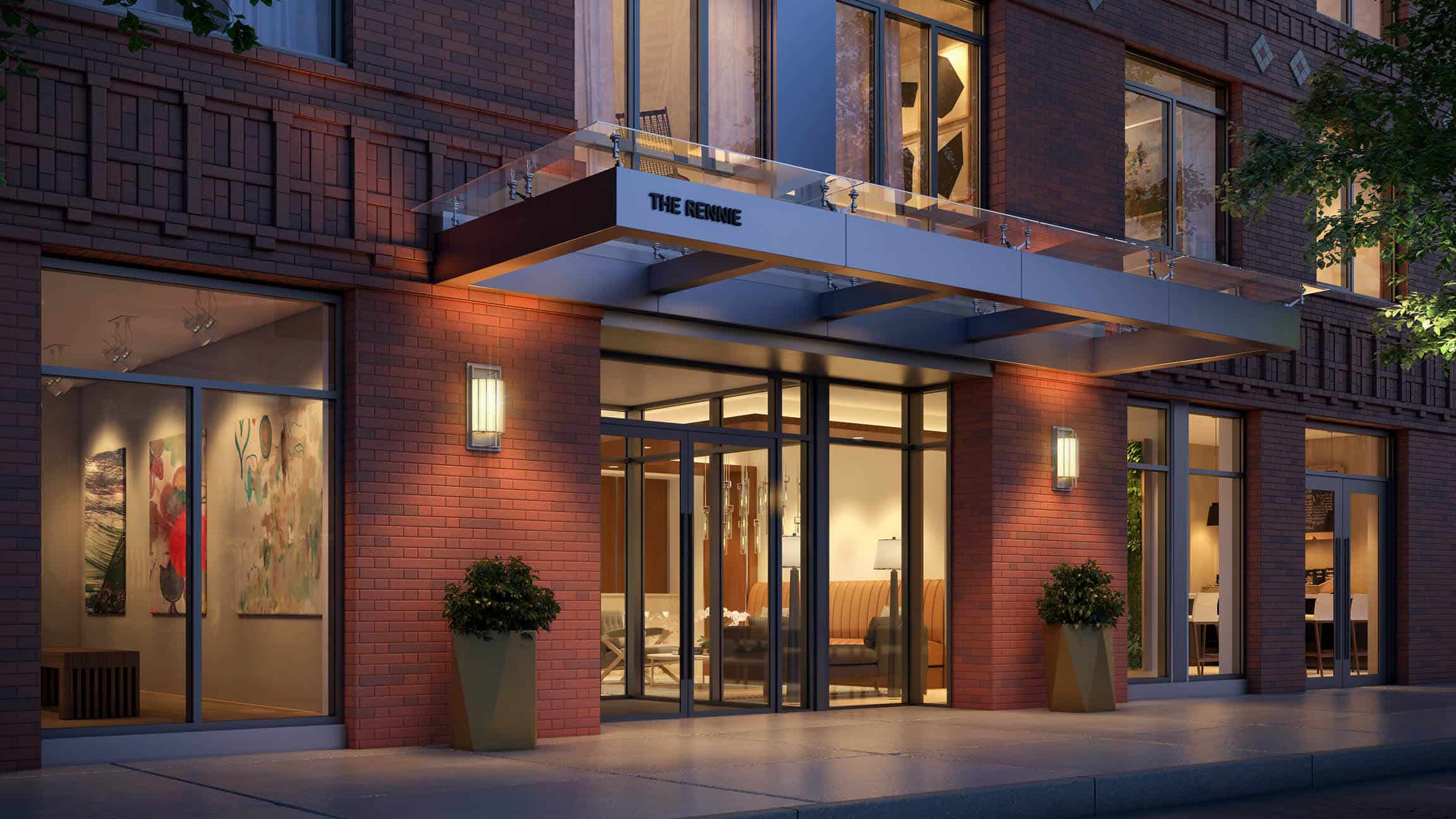
Armed with a new story and visual identity, we brought Stake to life through a wide range of touchpoints, including investor decks to aid the business during funding, language to apply in new collateral, and a fully designed website that harnesses the sleek yet approachable visual system. With all of these materials in place, Stake now has a bold and welcoming brand ready and waiting for its upcoming apartment rollout in Williamsburg, Brooklyn.