Subscribe to Our Newsletter
A comprehensive brand audit—an analysis of the current state of a brand and its position in the marketplace—is the foundation of any new brand or rebranding initiative. By determining the strengths and weaknesses of the brand in relation to its market and competitors, the audit helps navigate a clear path to a differentiated and authentic brand platform. Brand audits include the assessment of audience, positioning, strategy, voice and messaging across the entire competitive landscape.
One important component of a brand audit is an analysis of the visual brand—the logo, colors, imagery, typography and other elements that express a brand graphically. This process should run simultaneously with the broader brand audit, so that you’re ready to apply decisions about positioning, strategy and voice to the new visual brand. Most often, your branding agency will take the lead in the visual brand audit and present its findings and analysis as part of the rebranding process.
Once the competitive set has been defined, visual materials are gathered, organized and categorized, and the results compared and analyzed. This is one of the most enjoyable parts of the brand audit process, as the ownable whitespace and the visual landscape start to emerge.
1. Gather Visual Materials
Much of the competition’s visual material can be pulled from publicly available sources such as websites, trade show exhibits, advertising, digital campaigns, blogs and social media. Some large companies even post their corporate graphic standards online. If possible, your team should try to obtain collateral such as sell sheets, presentations or other non-public brand expressions. Video storytelling has become an invaluable element of brand expression, so videos should be gathered, too—it’s important to see what the competition is doing in this area.
Within your own company, gather every bit of marketing material you can find, including internal communications from groups such as HR and facilities. The visual elements of a brand can take a beating from well-meaning internal users operating outside the marketing department, who may not have the guidance they need to use brand materials appropriately. Understanding how brand visuals are being used (or abused) can help you develop tools and “libraries” to assure that the new brand is deployed appropriately and consistently throughout internal and external communications.
2. Organize and Categorize
Each visual brand element should be isolated and organized into a side-by-side comparison within the competitive set: logo, color, typography, graphic elements and imagery. Patterns and similarities within these elements will start to emerge, pointing the way to differentiated space.
The design team should create separate boards for each element, placing all the logos together on one, for example, and creating another with samples of brand typography. If the set is large enough, a bubble chart can be created to help visualize the frequency of color use in the competitive set. Imagery should be sorted by type: product photography, corporate and sector imagery, illustration, charts and graphs.
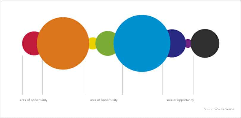
Color opportunity analysis using bubble chart
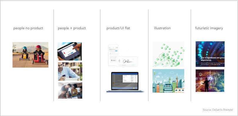
Imagery analysis
3. Compare and Assess
With all the visual elements organized and arrayed, it’s time to assess the competitive set and look for opportunities to carve out a differentiated visual space.
The comparison may reveal that there’s a preponderance of red in your industry, or that most competitors are using a generic sans-serif font in their materials. Color decisions can be very subjective, so color proposals will be better received if presented within the context of your specific competitive set.
When we reviewed the brand color landscape for our client OneSpan, we located an opportunity in the purple/violet color zone. Most of the company’s competitors clustered around bright blue, there was a clear opportunity to differentiate.
In B2B industries, photography content and style are often surprisingly similar, especially if there’s a heavy reliance on stock imagery. But finding a distinctive visual style is critical. Reaching today’s audiences, even in B2B, depends on grabbing attention with dynamic imagery. And the imagery toolkit needs to encompass a range of elements that can be employed across multiple channels and applications.
For OneSpan, we developed a set of ownable patterns that convey the company’s brand personality. They are also flexible enough to work effectively across contexts, from trade show exhibits to website landing pages.
4. Learn From the Broader Brand Audit
At this point in the brand audit process, the non-visual aspects of the brand will also be defined. Determinations about brand voice, personality, and positioning will help inform decisions about visual elements.
The design team will look for cues to help guide design choices such as typography and color. Is the brand voice friendly and optimistic? This may point to a light, open font and a bright, welcoming hue. An introspective, wisdom-infused brand voice might suggest deeper colors and a classic serif typeface. Combining this with the opportunities identified in the visual audit will help define an effective and differentiated visual style.
Our recent rebrand of an industrial-products client showed that its competitors tended to use generic product shots, only occasionally showing end users with their products. Since the brand audit revealed that customers depended on the advice and expertise of the company to solve their thorniest technical challenges, it was a no-brainer to develop a photographic style that showcased company reps engaged in active collaboration with their customers.
By the end of the audit, your new brand should have a solid foundation—a clear, differentiated visual direction that will advance the business’s new strategy.
To learn more about conducting a visual brand audit, contact us.