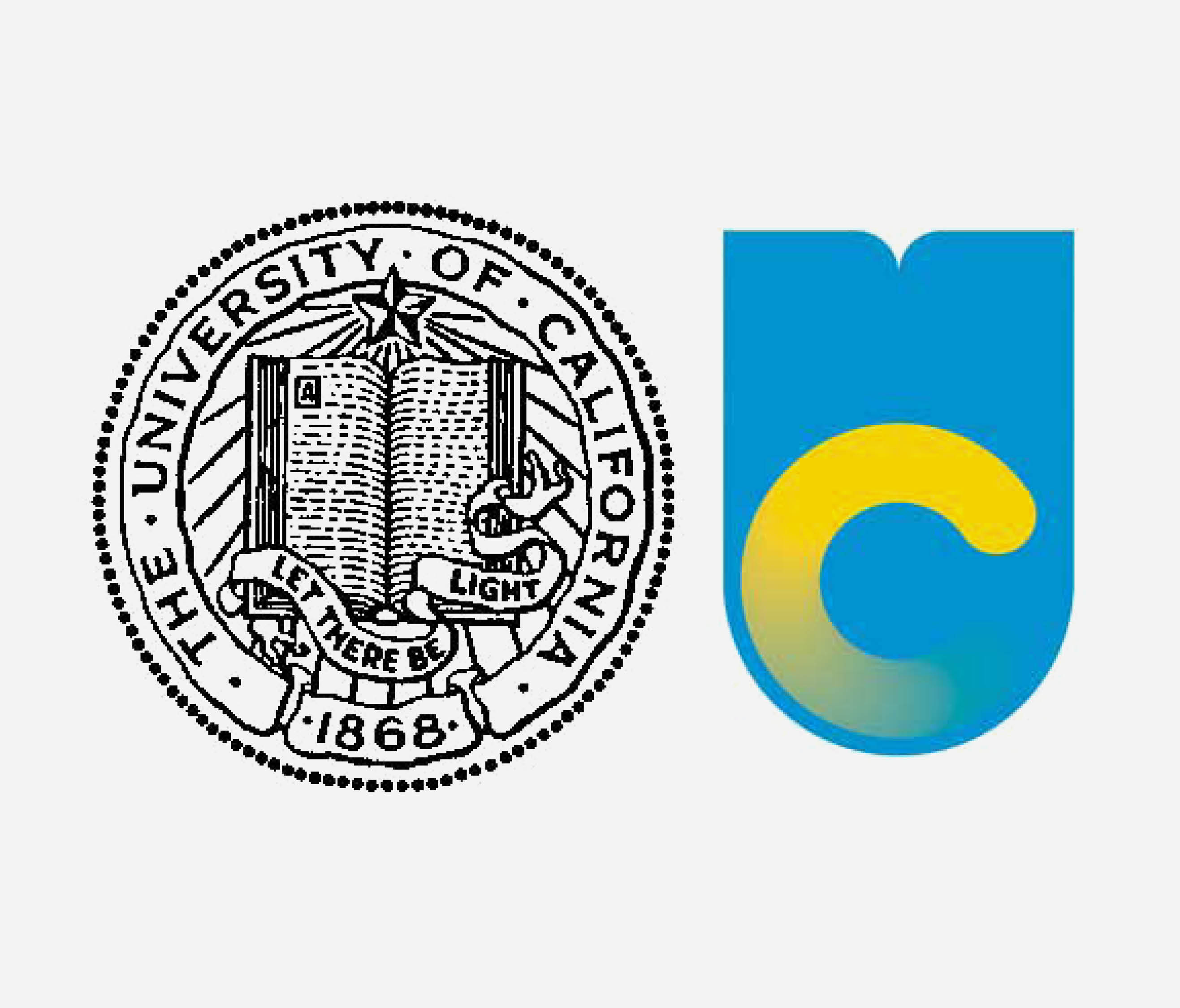
university of California crest

This year, the University of California debuted a new logo, meant to “project a forward looking spirit” and act as an adaptable image for the university in an increasingly digital world. Unexpectedly, the rebranding resulted in widespread backlash from the student community, including an online revolt with mocking memes, Twitter insults, and widespread dissatisfaction with the new logo throughout the university community. The reaction was so severe that the school decided to retract use of the new logo entirely.

While it is not always possible to please everyone when going through a rebranding, there are a few things that any organization can do to build consensus and ensure a more successful launch.

Make sure the new brand tells the right story.

It became very clear after the launch of the new brand that, for UC students, the heritage and history associated with the traditional seal is an important part of their university experience. The introduction of a radical new logo, meant to symbolize growth and progression, failed to align with the perceptions and values the students held for their alma mater. This is an important lesson for any organization going through a rebranding. Conducting the proper research to uncover those attributes that are most important to key audiences – both internal and external – is critical to building the right strategy and telling the right story going forward. The logo, or any other element of the brand identity, must then capture this story in a clear and compelling way.

Gain buy-in from key stakeholders.

The University of California may have avoided some of this backlash if it had more effectively communicated the new story behind the rebranding, offering an explanation for the logo in the context of the overall brand strategy. Doing preliminary testing to determine the reaction to the new brand among smaller groups of students may have also better prepared the university for the overwhelming reaction, providing them with an opportunity to develop the write messaging around the launch. Another effective approach to consensus building is to involve key audiences in the development process from beginning, so that they feel a sense of ownership and even pride in the new brand. Importantly, it is best to include many in the development process, but only a few in the final decision-making.

Test. Test. Test.

One explanation for UC’s new logo was that it would play out better on digital channels than the traditional seal logo. Yet, it is unclear how the new identity will be implemented across other channels. A gradient presents some challenging performance issues, especially when it comes to school uniforms. And which image will adorn graduation diplomas? To avoid brand dilution – or worse, confusion – an organization’s identity should be consistent at every touchpoint.  This can only be done through proper due diligence, testing out the look and feel through multiple integrated channels.

One successful example of a university rebranding can be seen with Cornell University. Designers on the project incorporated elements of the original logo from 1910, specifically color and insignia, into the new logo, refining – not revolutionizing – the design. The development process, which “involved input from a wide range of Cornellians, has culminated in a graphic identifier that has received praise from all corners of the campus.” Tommy Bruce, vice president for communication and media relations, who was also in charge of implementing the new logo said of the redesign, “We feel — and Cornellians have told us — that this new logo reflects the university’s rich history and academic identity, while providing a modern, clear and meaningful identifier for use in today’s diverse media.”

Cornell did a lot of things right in their rebranding. They got multiple groups involved in the development process, gaining buy-in and building consensus before the launch. They also did the research necessary – holding campus discussion groups and individual meetings with internal and external stakeholders – to understand what story they wanted to tell going forward. Lastly, they tested the new logo in a variety of applications and media, from print to apparel to web. Taking these crucial steps ensured a seamless transition and enthusiastic reception to the new brand. No matter what type of organization, careful attention to these imperatives before launching of a new brand can make all the difference between revolt and revere.

Rethinking Brand Identity After a Merger: A Visual History

With M&A activity at record levels, marketing thought leadership is abuzz with tips and tricks for maximizing the effectiveness of brand mergers. Such pieces often center on how to align corporate cultures and boost internal engagement. Without a doubt, these are vital issues that demand consideration. But is today’s culture craze sidestepping…
Envisioning Your Brand Image: Unlocking the Power of Visual Cues

The ironic thing about your brand’s image is that you can’t actually see it. Image as it relates to your brand is a metaphor, an idea meant to conjure up the assured sense of truth that comes with witnessing something concrete (and hopefully positive) with your own eyes. Your customers can’t see loyalty, trust, or any other quality, but an effective brand strategy can help them make the connection. First though, you’ll need to learn to see these qualities yourself.

Color Series: Stuck on Blue

“We’re looking for a unique brand color for our company. We really want to stand out.”

“Well, red would really differentiate your company.”

“Can’t use red. The CEO hates red. He hates orange, too.”

“How about green? Green has very strong positive associations and….”

“Nope. We don’t want to look like we…